
Helios Publishing House is a full-service publisher in Moscow, selling publications of various types. They provide authors with help for illustration, photography and retouching, design and layout, editing, proofreading, printing, and delivery.
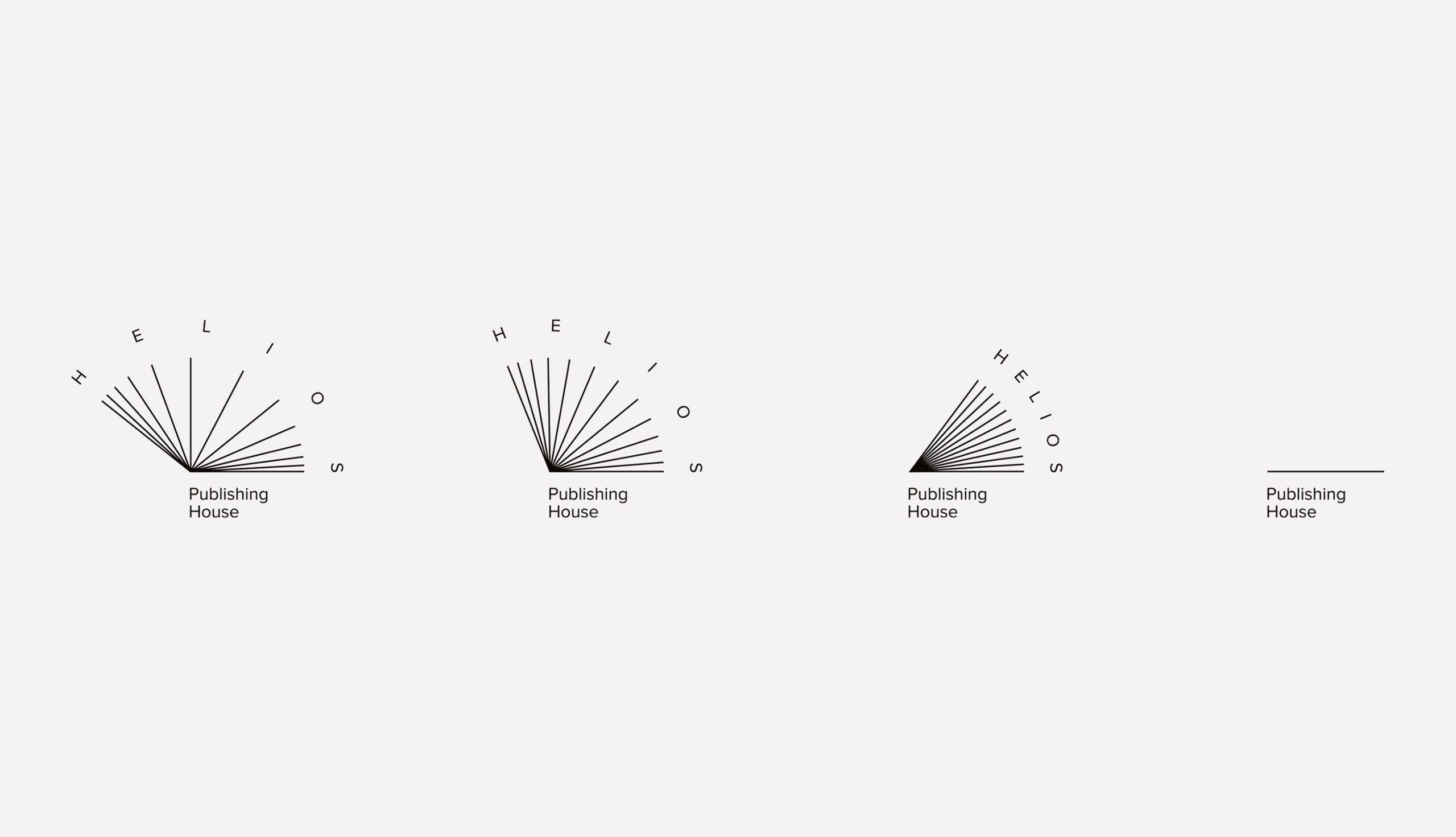
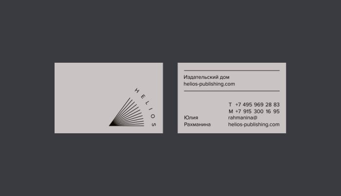
Oksana Paley and Alice Retunsky, co-founders of omsky, designed the Helios logo and visual identity, one that caught my eye after browsing the winning entries on the EDAwards website (this one picked up a silver award back in 2020).
In Ancient Greek mythology, Helios is the god and personification of the sun. “Like a ray of light, books elucidate the light of knowledge. The symbol combines both images: the sun and an open book.”



A glance at the Helios Publishing House website shows how the logo and overall identity hasn’t been done justice, which is a shame. But as designers, we can only do so much, because where implementation’s concerned, the ball’s mostly in the client’s court.
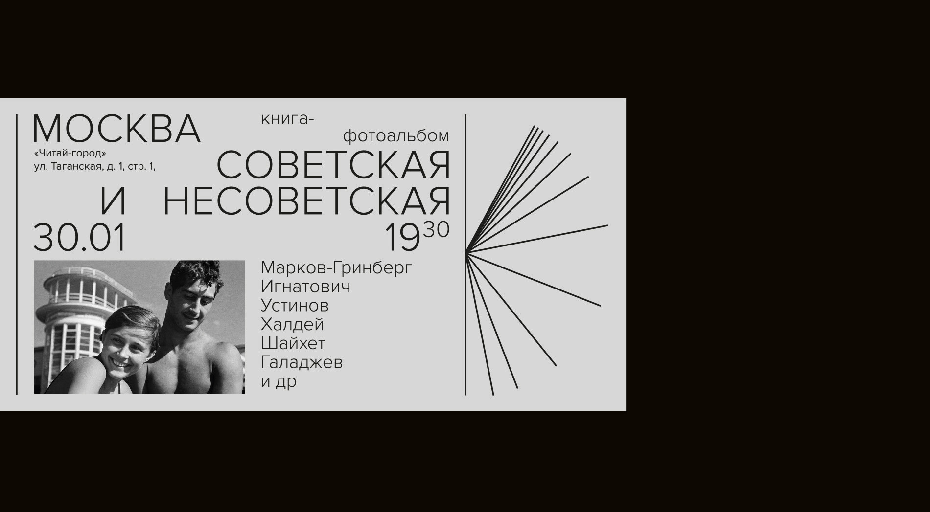
Still, lovely work, with a fitting touch of motion, and a flexible design for added visual interest in marketing material.

More from omsky studio.
In other news, if you liked this design, you might also like the slightly similar “vanishing” logo for Chornobyl Exclusion Zone (in the archives). Or for something a little different, read about the LEGO logo evolution.
Posted .
More on how marks like this are made in Logo Design Love, third edition.



Ruud van Bergen,
Thank you for sharing an animated logo again! (that Chernobyl logo was also amazing) It’s unfortunate, that the brand implementation on the company’s website is mediocre. Lovely to see that Omsky succeeded in displaying the logo to its maximum capacity.